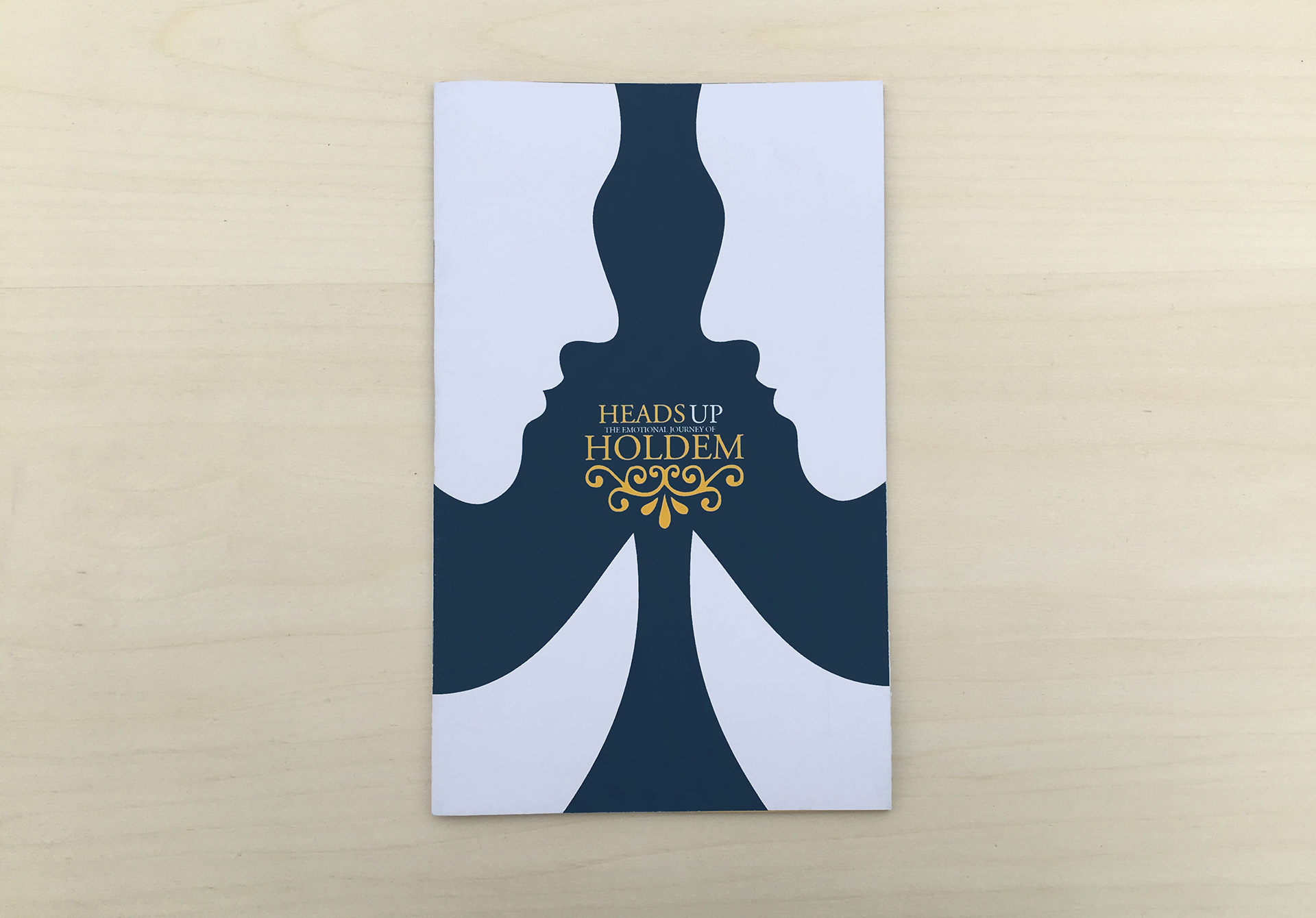
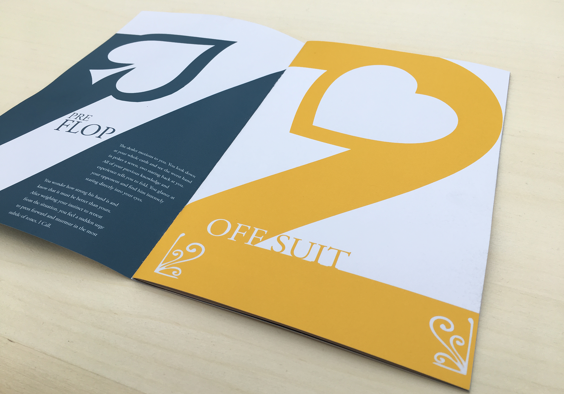
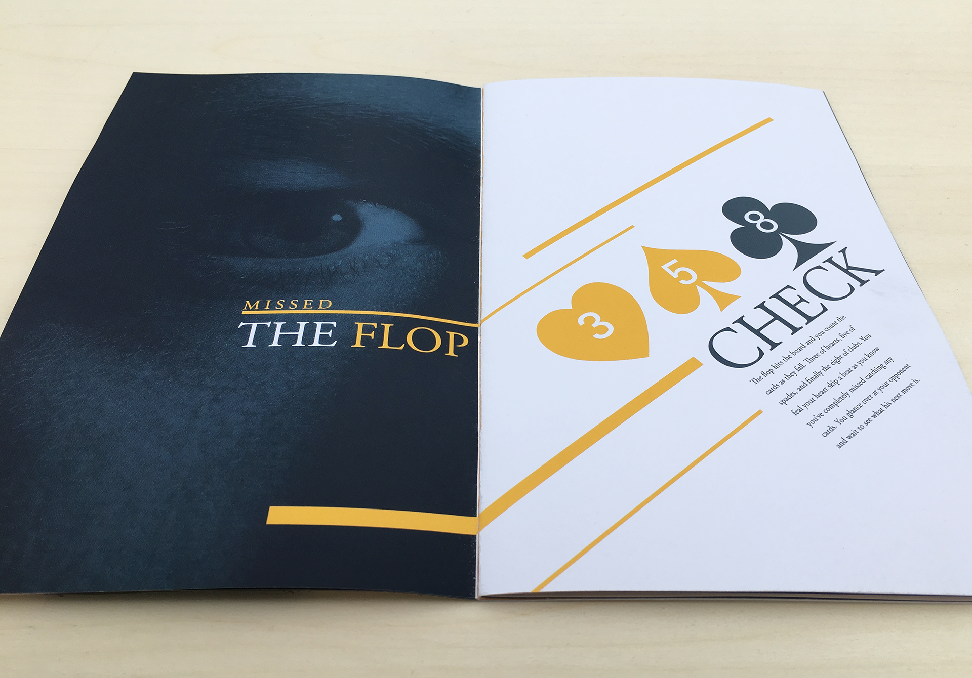
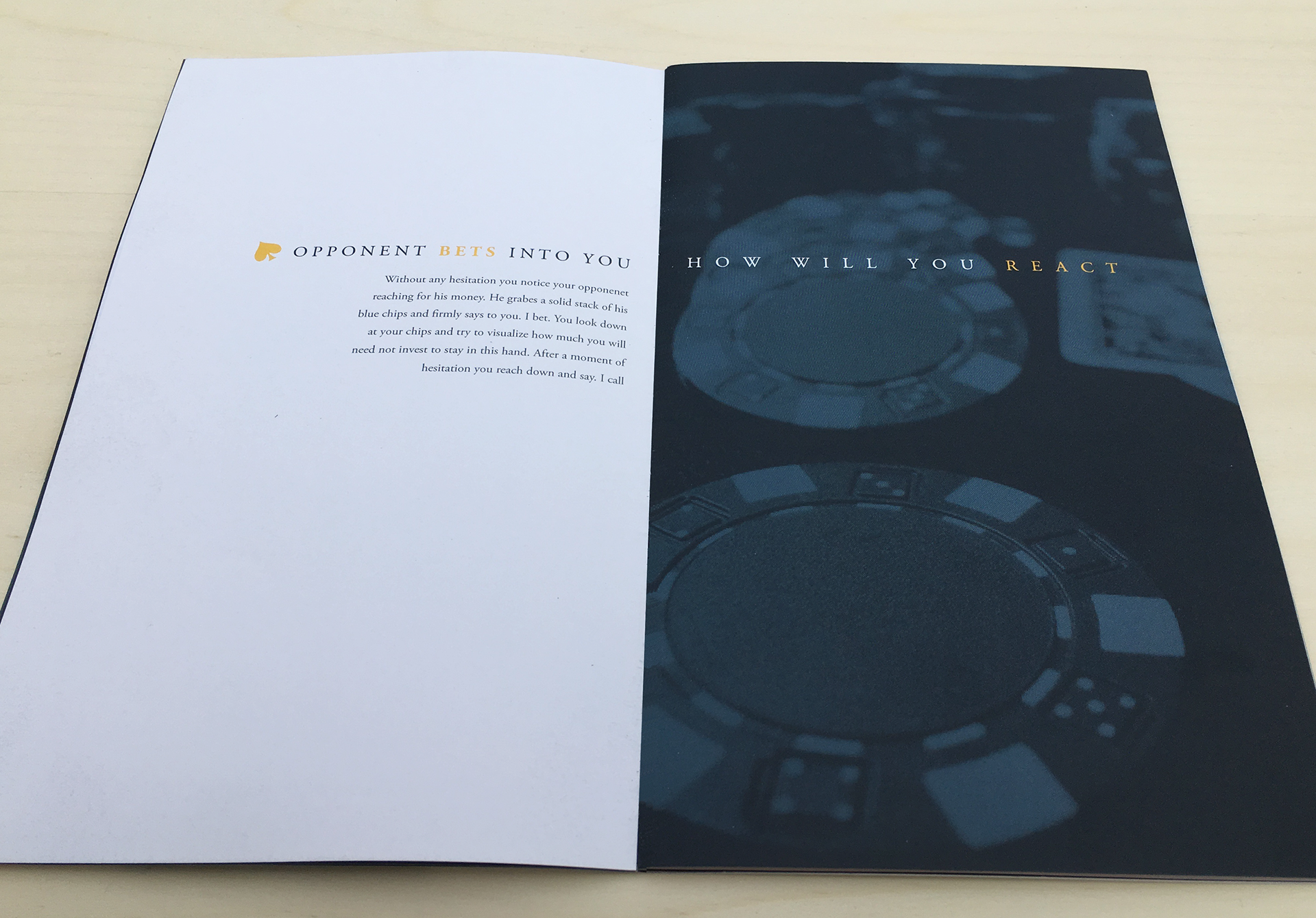
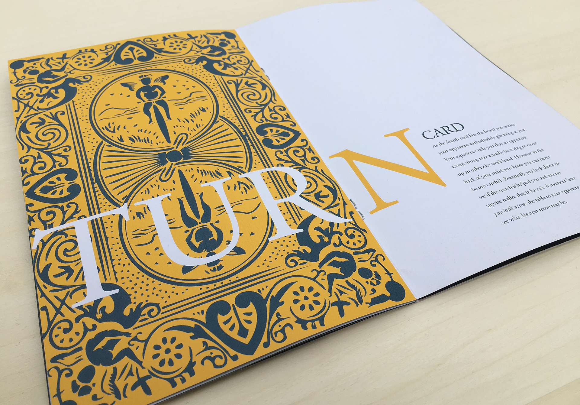
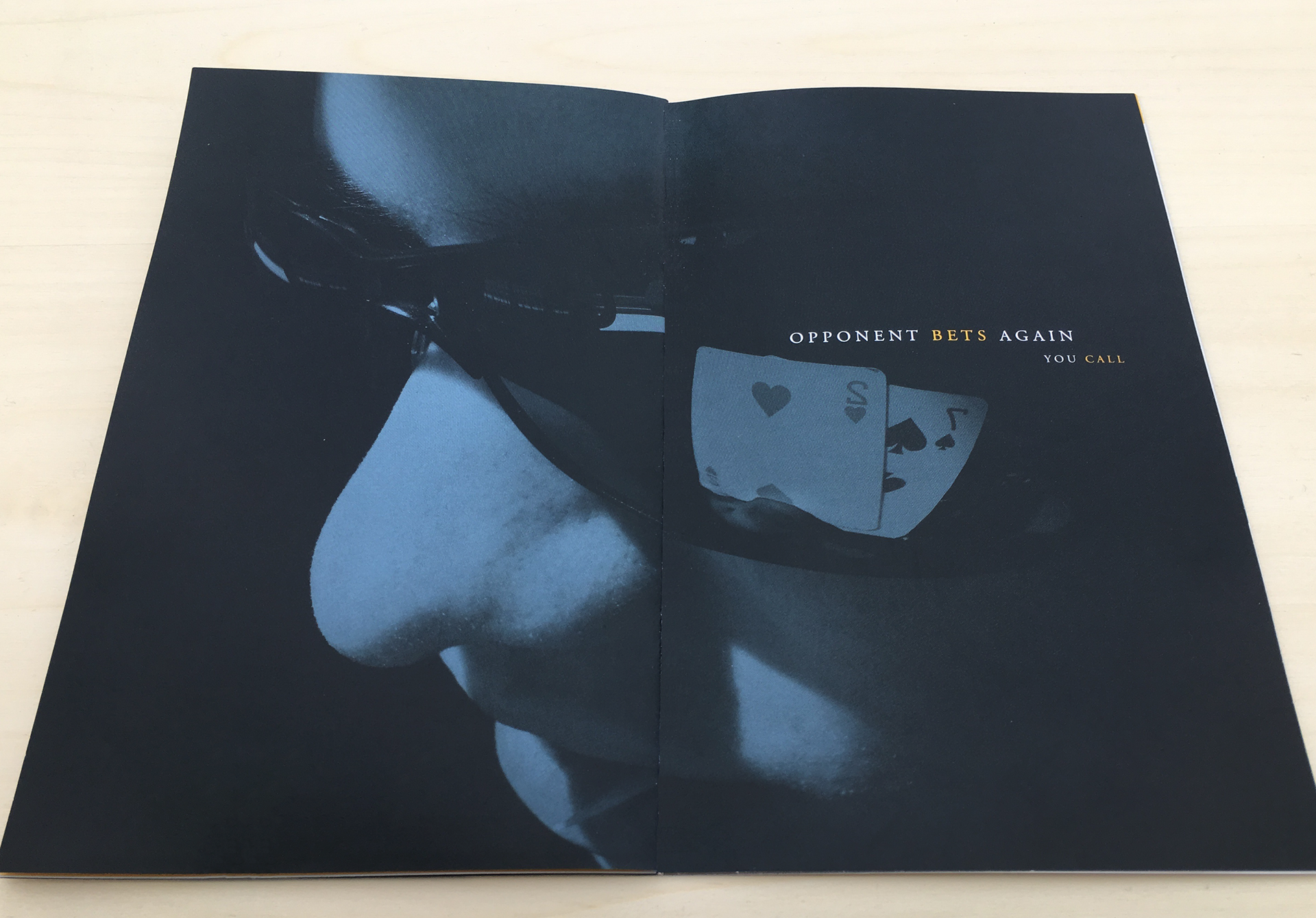
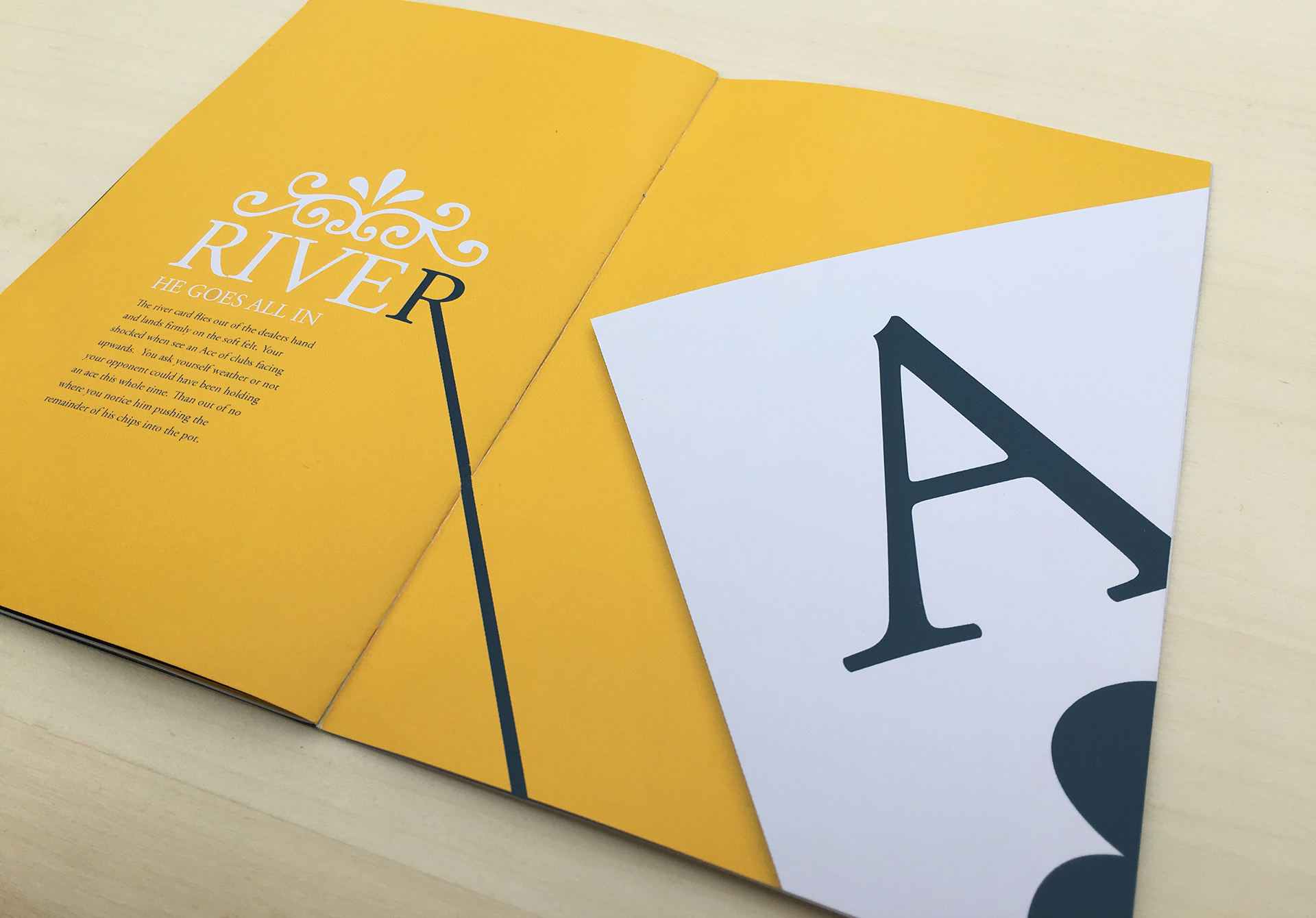
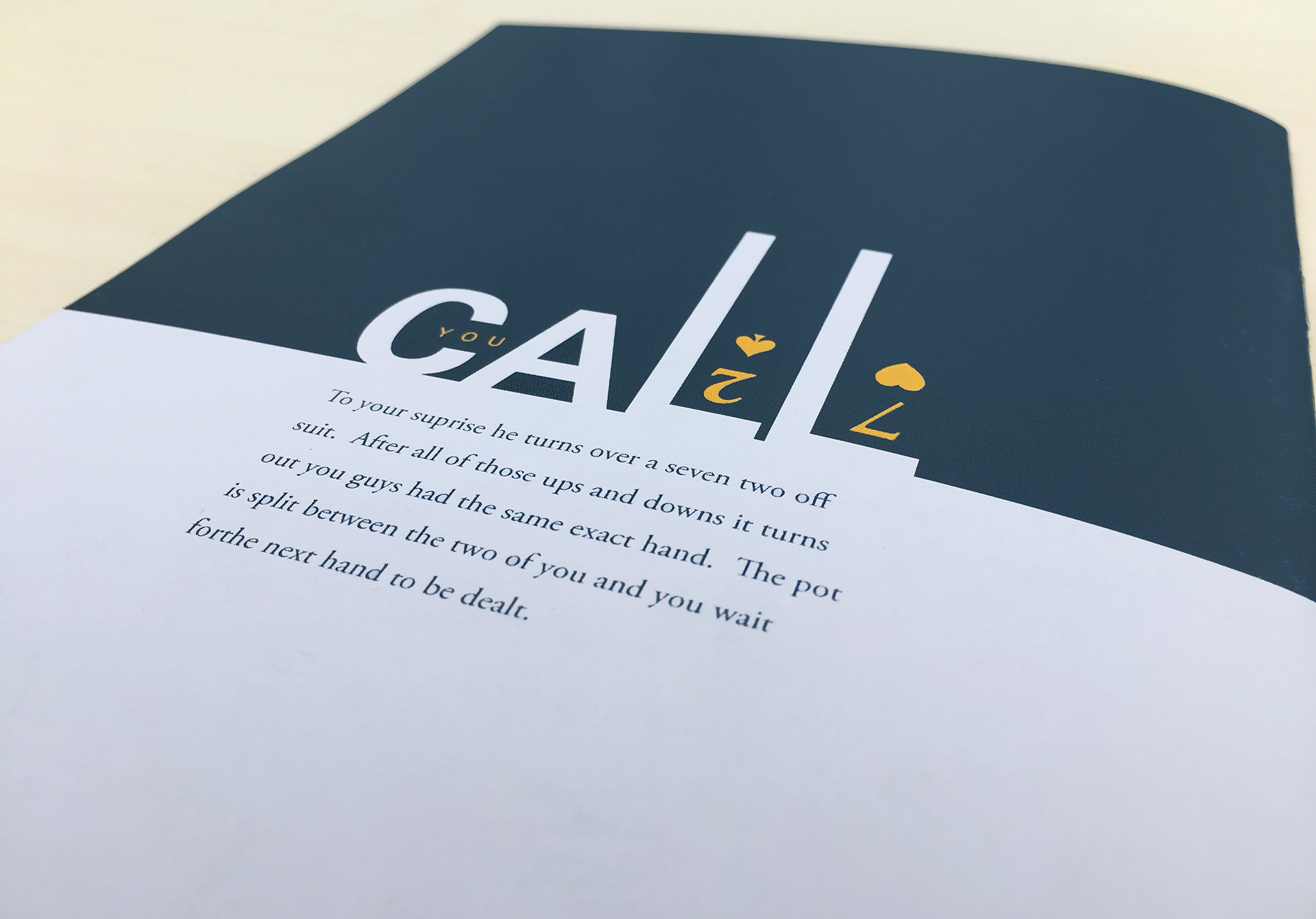

This booklet was designed to tell a story through typographic abstraction. It follows two poker players through one hand of heads up Texas Holdem. There is a great deal of contrast in both type scale and weight from one page to the next. While this creates visual interest, the type hierarchy has been designed in a proportional system keeping consistency between compositions. The color treatment is based on the interweaving of navy blue, gold, and white. These colors convey a sense of elegant sophistication, while also creating tension between characters. The type choices of both serif and san serif blend modern edgy lines with a elegant vintage charm.